Design Debate: Content Organization
Organizing content within a course is an important, if not sometimes daunting task to undertake as an instructor.

Organizing content within a course is an important, if not sometimes daunting task to undertake as an instructor. There are so many options within D2L, that it can quickly become overwhelming for those new or unaccustomed to the online space. In this article, we will look at two common methods of content organization and compare their efficacy.
Module Overviews
As a part of organizing content, instructional designers will often advise instructors to use some sort of organizational method to help students better navigate the course, situate upcoming content, and plan their time. This is the learner’s first experience with the content for that module or unit and the information in the overview sets the stage for everything to come. How might we set up an effective overview? Let’s look at a couple of fabricated examples based on what I have seen out there.
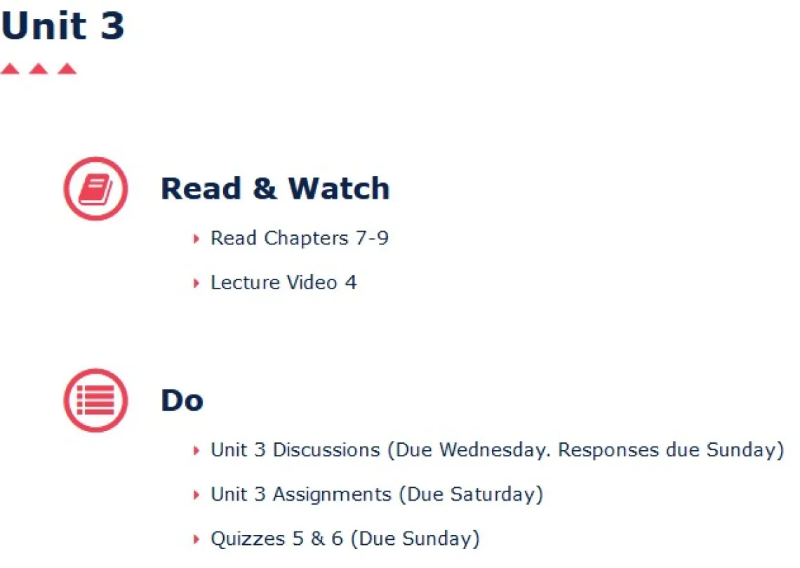
Example 1

Before moving on, take a minute to consider what information this overview truly provides the student. If you opened this up before the start of your week, how ready would you feel for what was to come?
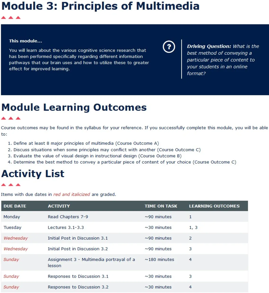
Example 2

In this case, there is a bit more information to take in. The text size has been reduced to fit on the screen. However, consider the elements present on this page, and how a student might feel in preparation for the week to come.
Consider the first example in contrast with the second. In which case does it seem the student would be better prepared for the week, planning their schedule, and which provides a clear indication of how what they are learning is preparing them to be successful in the course? It’s also worth noting that this alignment of activities and outcomes can also help with accreditation audits. Beyond this, content organization can take several forms.
Content Grouping
Module overviews aren’t the only aspect of course design that can benefit from good organization. Let’s look at different module or unit setups. After looking at their overview, the student wants to view their first activities within the course and get to their assignments. Maybe they finished their reading, and now need to find the lecture videos. Let’s take a look at what they might see.
Example 1

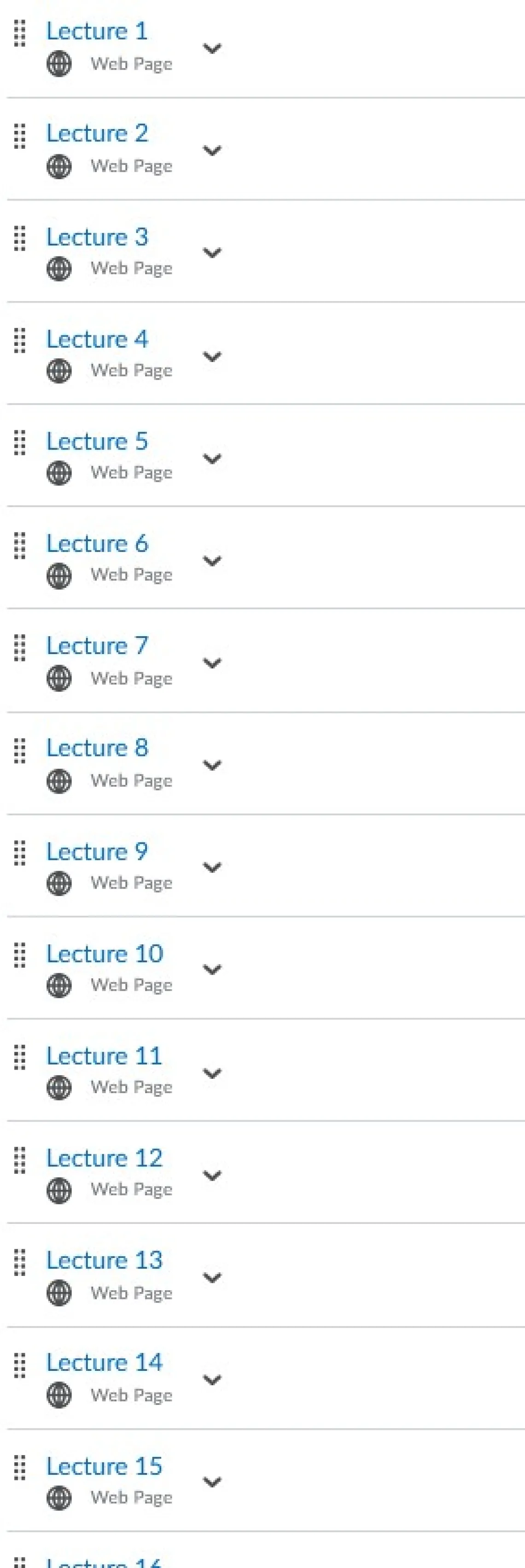
The student clicks on lectures to locate their next activity, and then they see the following:

Without going back to the previous image, do you know what lecture they are supposed to view? If you had to walk away for a moment or were interrupted, would you be sure you watched the right lecture? By putting all lectures in one folder, you create an unnecessary cognitive load on the student that has nothing to do with actually learning the content, only finding it. Once the students do find it, they have to go and click into each of these other modules to find their homework, and then quizzes. The level of cross-referencing information just to get to their required activities quickly grows frustrating and exhausting.
Example 2
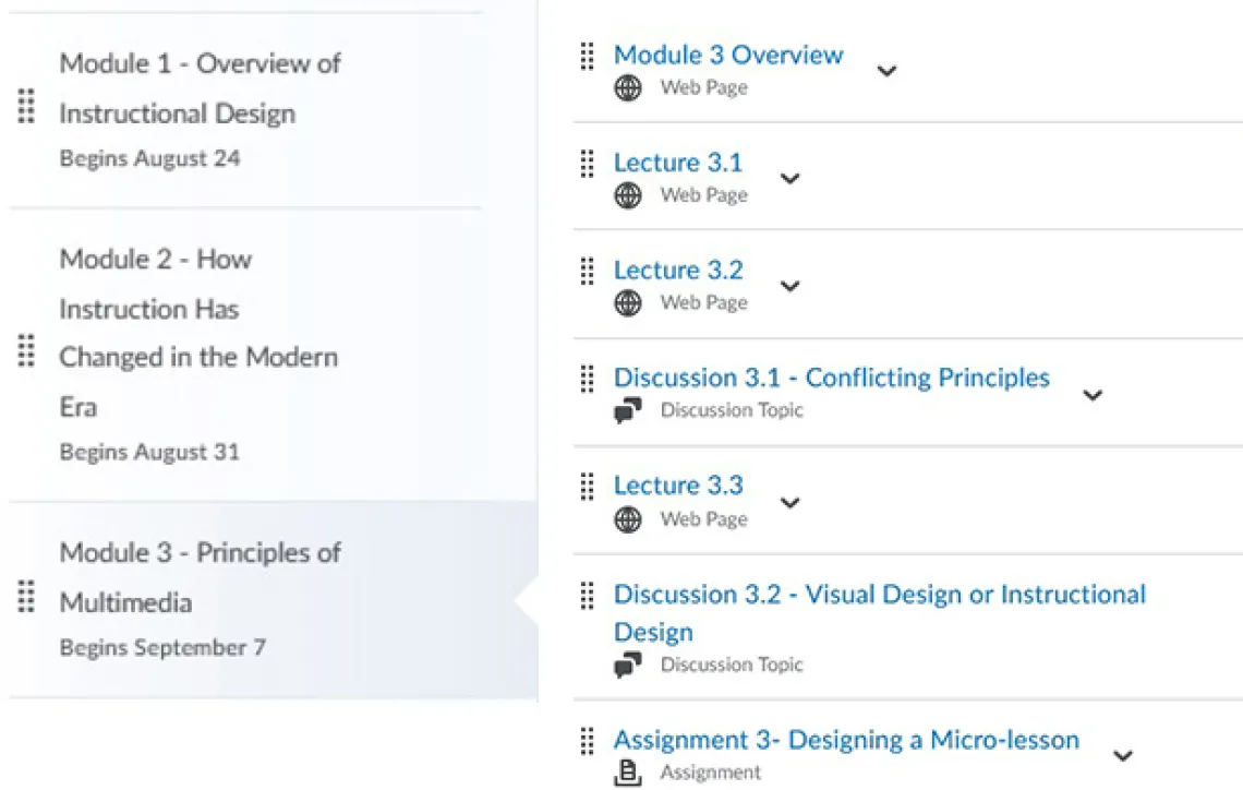
For something to compare, let’s go back and look at example 2. Similarly, after reviewing the overview, the student goes over their reading, then wants to view their lectures. Here is what they see:

This might look rather lengthy at first glance, but everything the student needs for that module is located in one space. Dates guide students to what module they should be looking at in any given week, and activities expected of the student appear in chronological order. This format mimics what was presented to them in the overview, adding a sense of the familiar, and reducing confusion and cognitive load, allowing them to focus on the content in the order it needs to be accomplished.
Summary
We have looked at two typical setups used by instructors in the Brightspace LMS. In example 1, we looked at what is sometimes referred to as a “content setup,” relying on organizing by content type, instead of by time. In example 2, we looked at organizing content by time, sometimes called a “module setup” or “weekly setup.” Both for overviews and organization of content, the “content setup” of example 1 proves to create additional cognitive loads aside from the actual course material.
Reducing unnecessary cognitive loads on students helps them remain focused and motivated, allowing them the mental space to be better students. Even hard-working, dedicated students can easily get tripped up and lose track of items when organization is not intuitive.
“I would consider myself a pretty dedicated student, and I rarely miss assignments. On the random occasions where I have missed assignments, I've noticed it was in classes that had a content setup.”
-Katie Courtney, University of Arizona student
There are certainly multiple ways to organize content that achieve what these examples show. Just remember to consider the student experience and if you are promoting getting students to their content easily and efficiently, in a way that makes sense to them, and providing clear and unambiguous instructions. Remember to work with your fellow instructors to ensure students all have a similar navigation experience throughout their time at the university.


